
Seesaw Learning Navigation Redesign
Led redesign of Seesaw Learning's desktop experience used by millions of teachers, students, and school administrators, leading to increased usability and 14% increase in conversion.
My role
Designer
What I did
Research Wireframe & Prototyping Design Data Analysis
Timeline
10 months
Tools
Figma Amplitude UserBrain Lyssna
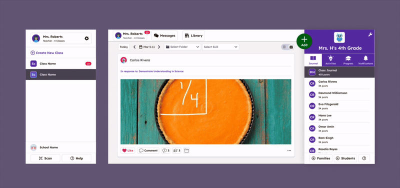
What is Seesaw?
Seesaw connects 25+ million teachers, administrators, students, and families to support each child's learning journey from PreK through 6th grade.
Within Seesaw, a teacher can:
- Send 1:1 and group messages to family members
- Document student work in a digital portfolio
- Assign interactive digital activities to students

The problems
User problem
Over time, we consistently heard that Seesaw's navigation made it hard for teachers to understand its full capabilities, causing them to miss valuable features. In interviews and trainings, teachers often said, “Wow, I didn't know Seesaw could do that.”
Business problem
Many teachers used Seesaw for only one or two tasks, with low adoption starting early in the funnel—e.g., 55% never entered Messages in a given month. The unconventional navigation also made features hard to find and limited the product's ability to scale.

Where I always start: Research
I led extensive research to understand the problem space and validate our assumptions:
- 🎙️ Conducted Stakeholder interviews to help align on project goals.
- 📊 Analyzed current product usage metrics and key funnels.
- 🧐 Conducted competitive research of edtech products to identify common patterns.
- 🧪 Conducted interviews and usability tests of current product with new and existing teachers.


Aligning on project principles
Based on our research, we established three design principles to guide the project:
1. Get teachers to the starting point — Address funnel drop-offs by making key features like Messages and the Activity Library discoverable from the main navigation. 55% of teachers never entered Messages in a given month — we needed to change that.
2. Teacher and student experiences should match — The teacher desktop experience should mirror the student experience so teachers can model activities in the classroom.
3. Avoid mid-year disruption — Teachers are creatures of habit, especially mid-year. We needed to minimize disruption for existing teachers while improving the experience for new ones.
Design & testing
The design process was highly iterative, with multiple rounds of testing:
- 📐 Created wireframes and prototypes.
- 🧪 Conducted usability tests using prototypes with new and existing teachers.
- 🖼️ Conducted concept tests with existing teachers.
- 🧪 Worked with engineering to develop an A/B testing strategy using LaunchDarkly and Amplitude.


The vision
Mid way through the project, I created this animation to help align the team and create a shared vision of project scope.
Although the designs weren't final, it helped the team quickly understand that many changes were simply moving existing elements into more logical places - while some changes were net new, like adding a homepage. This animation served as a helpful artifact we returned to throughout the project.
Sweating the details


Final results
The new experience resulted increased conversion and set a flexible foundation to easily add new functionality.
16% increase
in entering Messages
14% increase
in sending messages
40% improvement
in median time to send first message
“It's easy to find what I'm looking for!”
Teacher in product survey response
“Everything looks great! I love the changes.”
Teacher in product survey response
16% increase
in entering Messages
14% increase
in sending messages
40% improvement
in median time to send first message
“It's easy to find what I'm looking for!”
Teacher in product survey response
“Everything looks great! I love the changes.”
Teacher in product survey response